

How to Choose Pottery Glaze Colors: A Cone 6 Guide
Last Updated: October 23, 2026
Quick Summary
Choosing pottery glaze colors starts with the feeling and mood you want a piece to carry, not with a color chip. Test glazes on your actual clay body at cone 6, because the same glaze fires differently on porcelain and iron-rich stoneware. Let texture and how the piece will be used guide the final choice.
- Ask what mood the piece should set, where it will live, and how it will feel in the hand.
- Iron in stoneware warms and darkens glaze, while porcelain keeps pale glazes bright and true.
- Test one, two, and three coats on tiles from your actual clay body, then fire to cone 6.
- Layer glazes with contrast in value, keeping the base thin and the top glaze to edges or one side.
- For daily-use pieces, prioritize a durable, food-safe satiny matte finish over delicate display surfaces.
Table of Contents
- Start With the Feeling, Not the Swatch
- How Clay Body Affects Glaze Color
- How to Test Pottery Glaze Colors Before You Commit
- Reading a Glaze Tile at Cone 6
- Layering Pottery Glazes Without Muddying the Result
- Pottery Glaze Color Combinations That Hold Up
- Matching Glaze to How the Piece Will Be Used
- Conclusion
- Frequently Asked Questions
Start With the Feeling, Not the Swatch
Choosing pottery glaze colors starts with the feeling you want a piece to carry, not with a color chip. At brilliantbluejay pottery, we build every piece around that idea first, because color is only one part of what you notice when you pick up a bowl.
A glaze can look calm in a photo and cold in your hand. It can read warm on a shelf and flat on a breakfast table.
So before you open a single glaze jar, ask yourself three things:
- What mood should this piece set?
- Where will it live, and in what light?
- How will it feel against your fingers?
Answer those and the color choices get much easier. Skip them and you will chase swatches for weeks.
Texture matters here too. A satiny matte finish and a glossy melt can share the same recipe and still feel like different pieces. The surface is part of the color story, not separate from it.
How Clay Body Affects Glaze Color
The same glaze can fire two completely different colors on two different clay bodies. That surprises a lot of people, and it is the first thing to understand about how clay body affects glaze color.
Iron in the clay pulls glaze toward warmer, darker tones. Porcelain stays bright and lets pale glazes read truer. A stoneware and porcelain mix sits in between, giving glaze a soft warmth without going muddy.
Here is the practical version:
- Porcelain: pale glazes stay clean and bright
- Iron-rich stoneware: whites go creamy, blues go deeper
- Mixed bodies: glaze picks up gentle warmth and variation
We work mostly in a stoneware and porcelain mix, fired to cone 6. That body lets a single white glaze react with the iron in the clay and break into soft variation across the surface. If you want to see that in person, the Misty Mugs show how one glaze can shift from rim to base.
How to Test Pottery Glaze Colors Before You Commit
Testing is how you learn to test pottery glaze colors without wasting a whole kiln load. Make small tiles, label everything, and keep notes. That is the whole method.
Here is a simple testing routine:
- Roll or press five to ten small tiles from your actual clay body
- Apply one coat, two coats, and three coats of the same glaze
- Add a second glaze over half of each tile to preview layering
- Fire to cone 6 with your normal schedule
- Write the recipe, coat count, and firing on the back of every tile
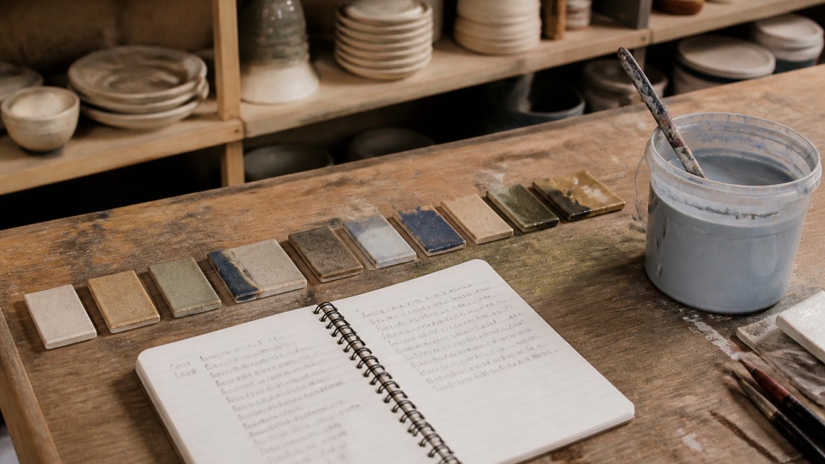
Keep the tiles. A tile library becomes your reference book, and it beats any online swatch photo. Glaze software and manufacturer test data can help you plan, but your own fired tiles are the only proof that matters for your clay and your kiln.
Reading a Glaze Tile at Cone 6
Cone 6 is a middle firing range, and glazes behave differently there than at low or high fire. Reading a glaze tile at cone 6 means looking for how the surface breaks, pools, and settles, not just what color it is.
Hold the tile in different light. Daylight, kitchen light, and shade will each tell you something different. Turn it over and check the edges, where glaze thins and color often shifts.
Look for these signals:
- Breaking: color thinning over edges and texture
- Pooling: glaze gathering in low spots and going darker
- Crawling or pinholing: surface faults that will show on a finished piece
- Color shift: how much the fired result differs from the wet glaze
Texture belongs in this reading too. Run a fingertip across the tile. A satiny finish feels different from a high gloss, and that difference changes how a piece reads in use.
The Blue-Green Stoneware/Porcelain Bowl is a good example of a cone 6 result read in person: soft blue-green, matte-leaning, and cooler and greener than photos tend to capture.

Layering Pottery Glazes Without Muddying the Result
Layering pottery glazes works best when one glaze leads and the second one accents. Two strong colors fighting for the same space usually turn muddy.
The reliable approach is contrast in value, not contrast in hue. Pair a light glaze with a darker one, or a matte with a glossy. Let the top glaze break over texture so the base color shows through.
A few rules we follow:
- Keep the base glaze thin and even
- Apply the top glaze to edges, rims, or one side only
- Test the pair on a tile before committing a whole piece
- Expect the top glaze to move in the kiln, not stay put
Pottery Glaze Color Combinations That Hold Up
Some pottery glaze color combinations hold their character through firing, and those are the ones worth repeating. The pairs below stay readable at cone 6 and keep their contrast.
| Combination | Why It Works | Best On |
|---|---|---|
| Blue-green + cream | Cool and warm balance | Bowls, mugs |
| Sand + deep sea blue | Soft ground, strong accent | Serving bowls |
| Peach + soft purple | Gentle contrast, low risk | Small vases |
| White + iron-breaking clay | Glaze reacts, clay shows through | Everyday mugs |
| Shino + dark accent | Warm base, defined edges | Large bowls |
Notice the pattern: one quiet tone, one stronger tone. The Sand And Sea Bowl shows a finished piece built on exactly that pairing. That pairing survives firing far better than two loud colors side by side.
Natural variation is part of the deal. Glaze moves, breaks, and pools, and no two pieces come out identical. That is not a flaw to fix. It is the reason handmade work looks alive on a shelf.
Matching Glaze to How the Piece Will Be Used
A mug you use every morning has different glaze needs than a vase that sits on a shelf. Match the finish to the job and the piece will earn its place in your routine.
For daily use, prioritize a durable, food-safe surface. A satiny matte glaze that leans durable handles heat, washing, and repeated handling well. For display pieces, you have more room to play with texture and softer, more delicate surfaces.
Ask yourself:
- Will this hold food or drink?
- Will it go in the dishwasher or microwave?
- Will it be handled daily or admired from across the room?
- Does the finish feel good in the hand?
If you are choosing glaze for a functional piece, browsing Misty Mugs built for daily use is a good way to see how finish and function pair up in practice.

Conclusion
The hardest part of choosing glaze colors is trusting your own eye over a screen. Swatches lie, photos shift, and the only real test is a fired tile in your hand under your own kitchen light.
Start with the feeling, respect the clay body, test before you commit, and let texture carry as much weight as color. For more on pottery topics, browse the Journal. Do that and the choices get simpler every time.
Frequently Asked Questions
How can you tell what a pottery glaze color will look like after firing?
You can't judge a glaze from the bucket or from a fired sample alone. Glaze color shifts with clay body, thickness, and firing temperature, so the reliable method is a test tile made from the same clay you're using and fired to the same cone. Brush or dip the glaze at thin, medium, and thick applications on one tile, fire it to cone 6, and compare. Keep the tiles labeled and on hand. After a few rounds you build a reference library that tells you far more than any product photo.
Can you layer different pottery glazes on the same piece?
Yes, and layering is where a lot of the most interesting surfaces come from. The main rule is to know which glaze goes down first and how thick each layer is, since a thin coat over a dark base reads very differently from a heavy coat. Test the exact combination on a tile before it goes on a finished piece, and keep notes on order and thickness. Some glazes run or react unpredictably together, so a tile fired to cone 6 is the only honest preview.
What colors work well together on pottery?
Combinations that share a temperature or a value tend to sit well together: warm creams with peach, cool blues with greens, deep browns with soft whites. Pairing a matte with a gloss in related tones adds contrast without fighting. The safest approach is to pick one dominant color, one supporting tone, and one accent, then test all three together on a single tile. Because clay body and glaze thickness both shift the final color, the tile is what tells you whether the pairing actually works.
What should you consider when choosing a glaze for functional pottery?
For mugs, bowls, and serving pieces, durability and food safety matter as much as color. A glaze that is durable and food-safe can handle daily use, while a decorative surface may be better suited to display. Consider how the piece will be washed, whether it goes in a dishwasher, and how the glaze wears over months of use. Texture matters too: a satiny matte finish feels different in the hand than a high gloss, and that sensory difference is part of why someone reaches for one mug over another.
